lundi 10 novembre 2014

Vintage younsters illustration


----------


          And also there is this image I have done for the amazing Alex100ans blog that tells the hundred years of Alex, a crazy woman.  Check it out, a tone of good illustrators posted up there, each illustrated one year of Alex' life.


jeudi 14 novembre 2013

Another monster illustration

----------


          So I'm continuing my experiments on light and dark patterns, concentrating on shapes and contrasts rather than volumes. I have to say that I really like the immediate impact that method brings to the the image. It forces me to make strong choices which i think my older stuff was lacking.

         Also i decided to go with deep blacks for several reasons. First it helps maximizes the contrasts and feel confident about the lighting, but the main reason is that i wanted a treatment that fits the genre of this illustration (fantastic). I thought that having large dark areas in which the details are lost helps to bring more ambiguity. You can't see clearly the monster. It's almost only defined by its silhouette and a few intriguiging elements and this is almost what the fantastic genre is about, not being sure of what we see, questionning the perception.

Light always plays an important part in classical fantastic movies/stories. Just think of Halloween when Micheal comes slowly out of the shadow or the first Alien, whose design almost consists of being a dark spot (idea brilliantly re-used in Attack of the Block, which i always recommend to all my friends to see).
I think a good monster design is not always about an accumulation of weird details but is also about what we don't see, or even better what we can't see, which makes the viewer wonder. So the way a creature will be lit should be thought of during the design phase.

jeudi 22 août 2013

Hello Stranger

----------


          I recently came across that post on the excellent ILLUSTRATIONART blog showing several Robert Fawcett sketches he did to demonstrate the benefits of carefully designing the     light and dark patterns.
Things fell into place when i read it. Robert Fawcett just put words and examples on something i was trying to figure out for a long time.

I love Robert Fawcett and i think this method is very important to study if you want to understand how were made illustrations in the 60s. Bernie Fuchs and Austin Briggs are also good artists to analyse while practicing the light and dark patterns method. Andrew Loomis also talks about it in is excellent Creative Illustration book.

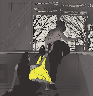
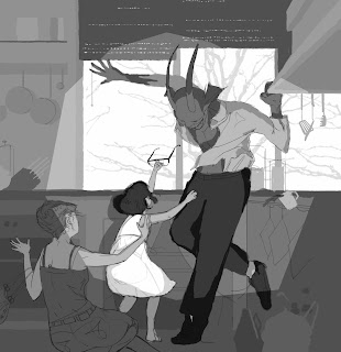
It becomes clear that using a single light source for your scene is necessary if you want to design light and dark patterns. Several light sources would confuse and distort the light and shadow relationship and would work against contrast and legibility. There is an entire chapter dedicated to it in Andrew Loomis' book.
Also, and that's what s great about it, using a single light source allows to remain realistic. In the every day life, it is pretty rare that several principal light sources are competiting. Think of the sun, the sky or the light on the ceiling. Our eyes are used to see single light sources everywhere, so light and dark patterns only make sense in our brains if they are originated from a single source.

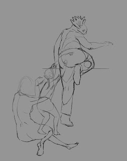
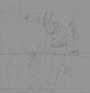
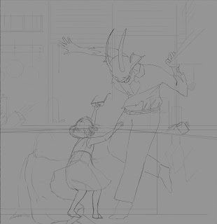
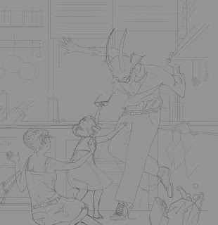
I also found interesting to focus on contrasts and design rather that rendering. Not that rendering should be left on the side but there is an order to follow. I used to concentrate on rendering to early in the process, without locking the light and dark patterns.

This is a good exercise and I think I'm going to experiment more in that direction.


vendredi 7 juin 2013

The Week End

The week end - illustration
----------


          I started to draw way before learning 3D, while I was a teenager. Back then i wasn't really concerned about volumes, textures and other parameters that obsess most of the people I know in the industry ^^ .

Now that i have a degree in digital 3d blablabla, i kind of want to go back to that "immediate" perception of a picture, without thinking about geometry and render issues.
The thing is, focusing too much on volumes can be counter productive. Every object, every part of an image doesn't have necessarily to pop up. It is ok if a shadow can be described as a flat and strong area and if it is not a collection of subtle volumes due to too much reflective light.
I tend to oppose little volumes to the graphic impact of a strong contrast, or composition in big masses. The use of indirect light often leads to soft contrasts and boring images when a simply structured contrasted image can be read instantly, with great efficiency. 

That is what I'm trying to do for a couple of month now, building differently my lighting and compositions. I like the idea of giving more importance to thumbnails and tiny color comps in the process. Since this is usually the first thing that we do, it tends to be forgotten when comes the lighting part and all its problems.
I find it to be a very interesting exercise since I suddenly have tons of new things to try.


I find the classical american illustrators very inspiring to study compositions in masses (Syd Mead or Austin Briggs for example)

This is my sister on her bed.

Daddy?


 ---------


          I have painted this one while reading the awesome Creative Illustration by Andrew Loomis, wich has been re-issued recently.

This is by far the most interesting book on how to create an illustration that i have read. While it contains some basic informations that we can read somewhere else, like perspective (but sometimes with an original take - "Informal Subdivision" for natural compositions is a good example) it as an hardcore approach while talking about black and white compositions, masses, color dynamic, light and shadow relationship, edges,  etc ...
Loomis doesn't only tell you that it is important to have a strong black and white composition, he details every aspect of the subject with a deep and yet accessible approach.

 Not to mention it is also a superb art book, with lots of amazing illustrations and examples.

What you learn goes beyond illustration and teaches you a lot of things for everybody interested in any type of images. I recommend it for compositing and lighting artists. It definitly helps to avoid the usual tricks. I can't wait and experiment new ways in Nuke and Maya now.


I have got to say that it is going to take me several illustrations to really understand and incorportate Andrew Loomis methods.


samedi 1 septembre 2012

MultiPlane

I plaid around with Nuke and this previous image i did sometimes ago.

Canope Multiplane from Clement Renaudin on Vimeo.

samedi 14 juillet 2012

Shyness


----------


Here is a step by step for the persons who are interested. I tried a new process on this one, I'm not sure if I'm gonna keep the most part of it for the next illustrations.